Notes
Introduction to CSS Grid Layout
CSS & Sass
7 minutes
A true grid is two-dimensional. The two dimensions are rows and columns, and with grid layout you can control both at once. With flexbox, you choose whether to lay the items out as a row or a column, one or the other and not both.
Why CSS Grid?
With CSS Grids you can not only hide/show things or adjust sizes or move items along one direction, you can actually change the order of HTML elements. You can move elements in both directions, PLUS do whatever you are able to do before with
@mediaandflexin terms of responsive design.You can define and change
grid-template-areasbased on screen sizes (with media queries)You can also change the number of columns and rows based on the screen size two (the cleaner and simpler equivalent of Bootstrap’s
col-xs-8 col-sm-6 col-md-4 col-lg-3.. )
tl;dr
- You can change the order of HTML elements using only CSS. Move something on the top to the right, move location info that was in footer to the sidebar etc. Instead of moving the div from
<footer>to<aside>, you can just change it’s placement withgrid-area - You can easily have a 12-column grid with one line of CSS.
grid-template-columns: repeat(12, 1fr)
Layouts today are
Floating and clearing and nesting and nesting and nesting
- CSS Grids takes the extra cruft away, leaving you with just semantic markup, letting you solve the layout problems in CSS, in a clean and simple way.
To put things next to each other we used floats. One item to the left, one to the right, and the box that surrounds them collapses - because floating pulls stuff out of the structure of the document.
Flexbox works in only one direction, either horizontal or vertical. It can not do things like place two items next to one another and then one piece not. flexbox will treat all three as the same item (flex-item).
So what you do is put them inside another flex box and deal with them separately
Float and Flex force us to put extra content inside our HTML for the sole purpose of layout
- Nested elements inside elements inside elements. Take Bootstrap for example:
1<div class="row">
2  <div class="col-sm-9">
3    Level 1: .col-sm-9
4    <div class="row">
5      <div class="col-xs-8 col-sm-6">Level 2: .col-xs-8 .col-sm-6</div>
6      <div class="col-xs-4 col-sm-6">Level 2: .col-xs-8 .col-sm-6</div>
7    </div>
8  </div>
9</div>
CSS Grids are two dimensional, you can move things both horizontally and vertically.
Grid vs. Flexbox
Flex is one-dimensional - either horizontal or vertical, while Grid is two-dimensional, you can move elements in both horizontal and vertical planes
with grid layout we don’t need to add anything to the grid item to make the layout. Everything is being set on the container. In a flex layout you have to target the flex item to set the properties of
flex-grow,flex-shrinkandflex-basis
CSS Grid Terminology
- container (any container that let’s you contain a grid inside
display: grid. you can do this to as many items on the page as your want) - item (any direct descendant of a grid container)
- line
- cell
- track
- area
- gap
container
any container that let’s you contain a grid inside display: grid. you can do this to as many items on the page as your want
1<div class="site"><!--Grid container--></div>
1.site {
2  display: grid; // Element containing a grid
3}
item
- any direct descendant of a grid automatically becomes a grid item
 1<div class="site">
 2  <!--Grid container-->
 3  <header class="masthead"></header>
 4  <!--Grid item-->
 5  <h1 class="page-title"></h1>
 6  <!--Grid item-->
 7  <main class="main-content"></main>
 8  <!--Grid item-->
 9  <aside class="sidebar"></aside>
10  <!--Grid item-->
11  <footer class="footer"></footer>
12  <!--Grid item-->
13</div>
1.site {
2  display: grid; // Element containing a grid
3}
line
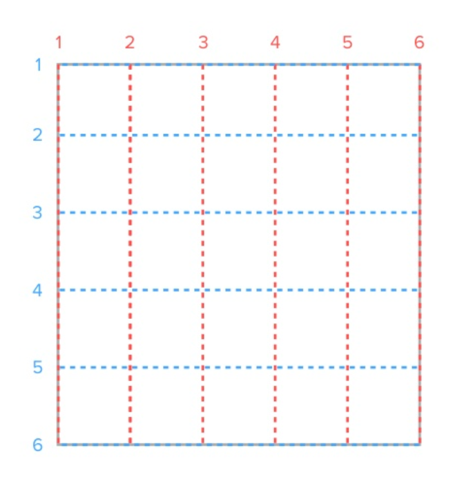
Horizontal (row) or vertical (column) line separating the grid into sections
Grid lines are referenced by numbers, starting and ending with the outer borders of the grid. First edge of the grid (on the left) either vertical or horizontal is number one
grid-template-columnsandgrid-template-rowsFor example:
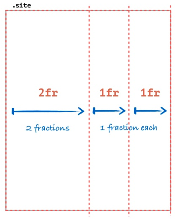
grid-template-columns: 2fr 1fr 1fr(takes list of length values: em, px, %, fr etc. denoting the distance between each line)fr(fraction) is a newly introduced unit for grids
cell
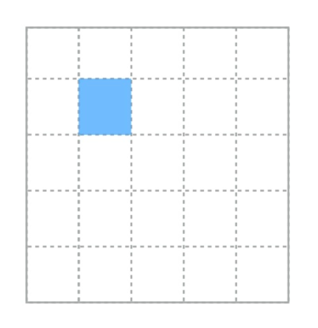
- A space in the grid between four intersecting grid lines
- smallest unit in a CSS grid
area
- rectangular area made up of one or more grid cells
- rectangular area between any four specified grid lines
- Grid areas must be rectangular in nature; it is not possible to create, for example, a T- or L-shaped grid area.
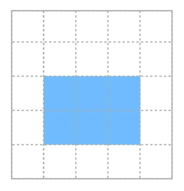
- You define the start and end grid lines for grid items with:
grid-columnandgrid-row(shorthand properties forgrid-column-start,grid-column-endandgrid-row-start,grid-row-end)
1// grid-column: start/end
2grid-column: 2/4
3grid-row: 2/3
The thing with
grid-columnandgrid-rowthough is the maths! You have to remember and/or calculate line numbers?! Err..grid-template-areasto the rescue! These basically let you define areas, give them a name, and let you reference areas by name. Here’s an example:
1grid-area: [area-name];
 1.site {
 2  display: grid;
 3  grid-template-areas: // applied to grid container
 4    'head head' // you're assigning cells to areas by giving the cells an area name
 5    'nav  main' // how many values kinda depends on how many cells you have in the grid
 6    'nav  foot';
 7}
 8
 9.site > header {
10  grid-area: head;
11}
12
13.site > nav {
14  grid-area: nav;
15}
16
17.site > main {
18  grid-area: main;
19}
20
21.site > footer {
22  grid-area: foot;
23}

track
- a grid track is a row or a column
- the space between two or more adjacent grid lines
- Row track is horizontal
- Column track is vertical

gap
- empty space between grid tracks, (aka gutters)
grid-gapis shorthand forgrid-column-gapandgrid-row-gap. e.g.grid-gap: 1emwill set a gap of 1em after every cell

Working with a grid
- Define a grid (
display: grid) - Draw grid lines (
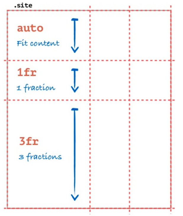
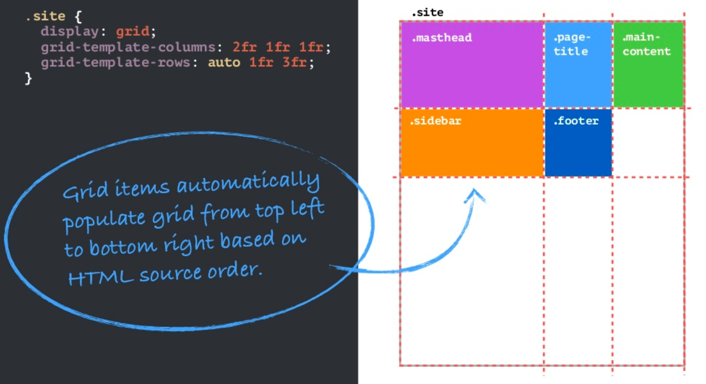
grid-template-columnsandgrid-template-rows) - Grid items automatically populate grid from top-left to bottom-right, based on HTML source order
1grid-template-columns: 2fr 1fr 1fr;
1grid-template-rows: auto 1fr 3fr;
Changing the order of elements based on screen size
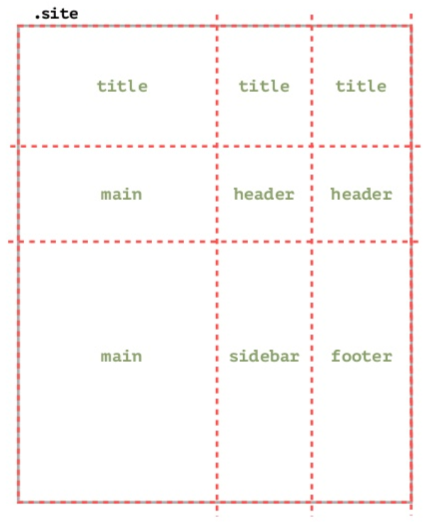
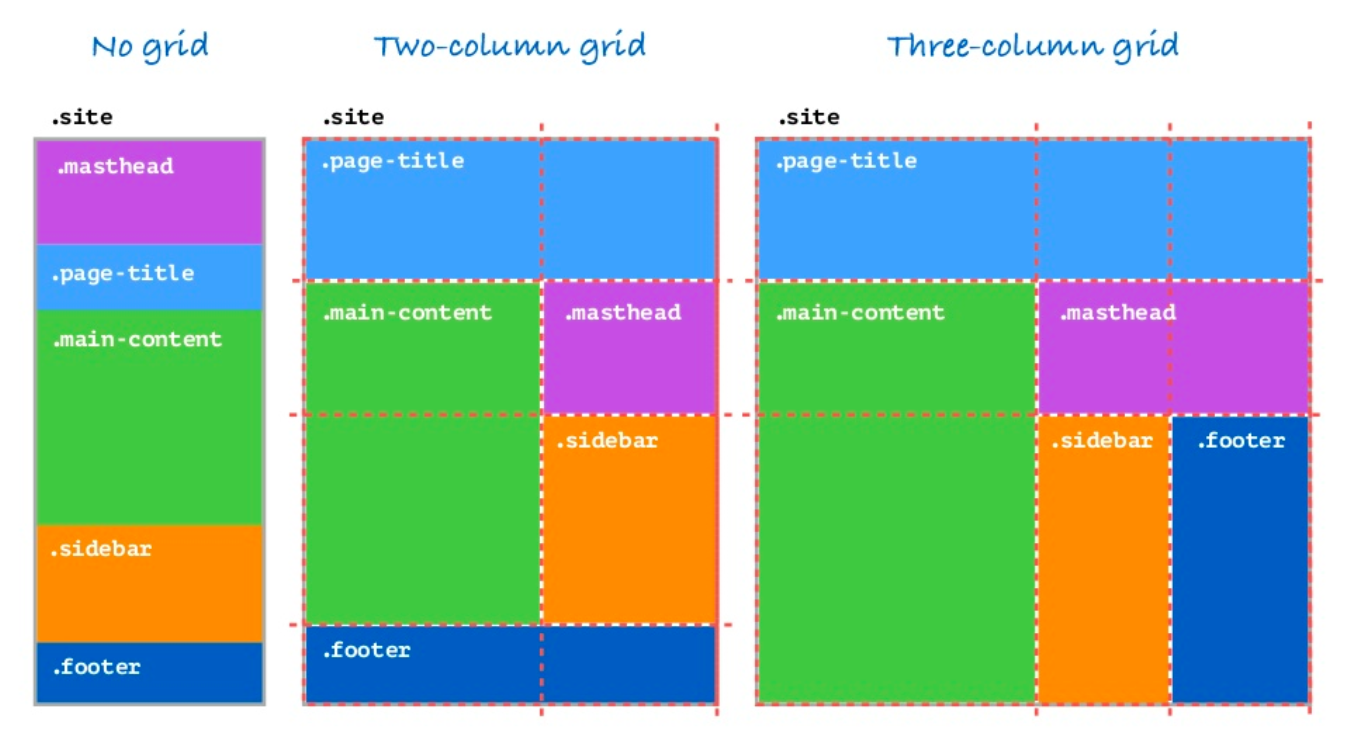
Let’s say you want to move the footer to the bottom on small screens and to the right on bigger screens and there’s a bunch of other HTML elements in between (i.e. the elements are not adjacent).
The simple solution is to change the grid-template-areas based on the screen size. You can also change the number of columns and rows based on the screen size too (the cleaner and simpler equivalent of Bootstrap’s col-xs-8 col-sm-6 col-md-4 col-lg-3 .. )
 1.site {
 2  display: grid;
 3  grid-template-columns: 1fr 1fr;
 4  grid-template-areas:
 5    'title title'
 6    'main header'
 7    'main sidebar';
 8}
 9
10@media screen and (min-width: 34em) {
11  .site {
12    grid-template-columns: 2fr 1fr 1fr;
13    grid-template-areas:
14      'title title title'
15      'main header header'
16      'main sidebar footer';
17  }
18}
BUT Support Backwards compatibility?
- CSS Grids are supported by all major browsers
- There is now a thing called a feature query
@support. Use feature queries to test for grid support in the current browser
1@supports (display: grid) {
2  ...;
3}
- If CSS Grid not supported, recommended is to serve the mobile site to all browsers
CSS Grid: A practical approach for today
- Build accessible, mobile-first layout without grid (this is your baseline). Make sure it works in all browsers in all sizes
- Use the mobile first layout as fallback for all browsers
- Use
@supportto detect grid support - At the appropriate breakpoint, create layout with grid and grid-areas
- Explore new layouts as viewport widens
- Use Firefox, Firefox has a Grid inspector
Examples
See the Pen CSS Grid by example - 1 by Aamnah Akram (@aamnah).
See the Pen CSS Grid by example - 2 (grid areas + grid gap) by Aamnah Akram (@aamnah).
Links
- Game: Grid Garden from the creator of Flexbox Froggy
- Youtube: CSS Grid Changes EVERYTHING - Amazing Presentation by Mor10
- SLIDES for CSS Grid Changes EVERYTHING
- Firefox: Grid inspector
- Grid by example, by Rachel Andrews
- MDN: CSS Grid Layout
- Github: Kuhn theme by Mor10
- Building Production-Ready CSS Grid Layouts Today
- Youtube: CSS Grid Layout Crash Course
- Smashing Magazine: CSS Grid Gotchas And Stumbling Blocks, by Rachel Andrews
