Notes
Styling checkboxes and radio
CSS & Sass
4 minutes
- You can either style the
::afterofinputor the::beforeoflabel - It has to be able to show styles when we Tab to the input, so i can’t do
display: noneon the original radio or checkbox
With ::before pattern i can’t do a this design
By default you can’t really style the checkbox and radio inputs.. What you can do is create your own.
You can add styles to the ::before and ::after to show the box or circle and change its colors.
There are two different ways you can write your HTML
1<!--
2 Input and Label next to each other
3 You have to manually link these two using `id` and `for`
4 -->
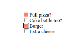
5<input id="pizza" type="checkbox" />
6<label for="pizza">Full pizza?</label><br />
7<input id="coke" type="checkbox" />
8<label for="coke">Coke bottle too?</label><br />
1<!--
2  Input inside Label
3  these get automatically linked together, clicking the label will click the input
4  -->
5<label><input type="checkbox" />Extra cheese? </label><br />
6<label><input type="checkbox" />Burger? </label><br />
Notice the <br />, input is display: inline-block and label is display: inline by default.
Can’t style checkbox and radio directly
If you try to style checkbox and radio input types directly, you’ll fail. The code below will never work and is entirely useless..
 1/* Checbox */
 2input[type='checkbox'] {
 3  background: red;
 4  color: yellow;
 5}
 6
 7input[type='checkbox']:checked {
 8  background: green;
 9  color: blue;
10}
11
12/* Radio */
13input[type='radio'] {
14  background: orange;
15  color: orangered;
16}
17
18input[type='radio']:checked {
19  padding: 2em;
20  background: thistle;
21  color: plum;
22}
Using label, span, ::before, ::after or +
the + is for sibling elements. checkbox[type='radio']:checked + label will actually select the label next to the radio input that is checked.
Here’s a quick run down of child and sibling selectors
>child combinator selector (direct descendant)+adjacent sibling combinator (directly after)~general sibling combinator (anywhere after as long as it’s on the same level)
The ::before and ::after on input
I prefer this one because it is neater and simpler code. You don’t worry about the labels and use the ::before on input. With this you also don’t have to worry about hiding anything or being able to tab through
These styles don’t care if your code was <label><input></label> (input inside of label) or <label></label><input> (label and input next to each other)..
 1/* Checbox */
 2input[type='checkbox'] {
 3  position: relative;
 4}
 5
 6input[type='checkbox']::before {
 7  position: absolute;
 8  width: 1em;
 9  height: 1em;
10  content: '';
11  top: 0;
12  left: 0;
13  background: wheat;
14}
15
16/* Checbox - checked */
17input[type='checkbox']:checked::before {
18  background: crimson;
19}
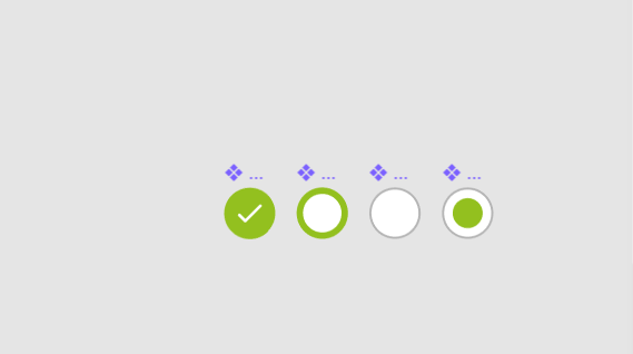
We have now something that looks like this image
To make this work for both radio and checkbox, just combine them
 1/* Checbox & Radio */
 2input[type='radio'],
 3input[type='checkbox'] {
 4  position: relative;
 5}
 6
 7input[type='radio']::before,
 8input[type='checkbox']::before {
 9  position: absolute;
10  width: 1em;
11  height: 1em;
12  content: '';
13  top: 0;
14  left: 0;
15  background: wheat;
16}
17
18input[type='radio']:checked::before,
19input[type='checkbox']:checked::before {
20  background: crimson;
21}
Now you’re set to style them however you want. I added a border and some margin
 1/* Checbox & Radio */
 2input[type='radio'],
 3input[type='checkbox'] {
 4  position: relative;
 5  margin-right: 0.4em;
 6}
 7
 8input[type='radio']::before,
 9input[type='checkbox']::before {
10  position: absolute;
11  width: 1em;
12  height: 1em;
13  content: '';
14  top: 0;
15  left: 0;
16
17  border: 1px solid dodgerblue;
18}
19
20input[type='radio']:checked::before,
21input[type='checkbox']:checked::before {
22  background: crimson;
23}
24
25// Checkbox
26input[type='checkbox']::before {
27  border-radius: 2px;
28}
29
30// Radio
31input[type='radio']::before {
32  border-radius: 50%;
33}
And i took out the background color i had given the radio/checbkox. This is where i notice the issue with this approach
It’s not replacing the original radio and checkbox, it’s adding styles on top of it.. I can still see the original border underneath, and if i hide it or adjust opacity, it applies to my custom styles as well..

You can do appearance: none, but that is not very cross-browser friendly and it also messes up all styles (which i don’t feel like spending the time on fixing..)
1input {
2  -webkit-appearance: none;
3  -moz-appearance: none;
4  appearance: none;
5}
The above is fine i guess, as long as you always have a background-color. But i wanted to test the other approach too, so now i’m on to styling the label instead of the input..